The Makers Dozen
by Megan Batoon
Twelve shades inspired by the rhythm and joy of the creative process.
Introducing
The Makers Dozen Collection
Megan Batoon’s color collection is inspired by the process of making- the quiet starts, the messy middles, and the small, electric moments when something finally clicks.
Each of the twelve shades reflects a piece of the creative process. From a strike of inspiration to the flow state where time and the outer world disappear.
Every shade honors the act of exploring, experimenting, and creating something that didn’t exist before.
The first draft is not the final draft- it's a starting point to the endless journey of making that evolves as you do.


Back to One
A soft, misty off-white with delicate cool undertones that feels like a deep breath and a fresh start. True to its name, this calming shade resets the senses, offering a beautifully imperfect, versatile foundation for your next creative endeavor.
SHOP NOW →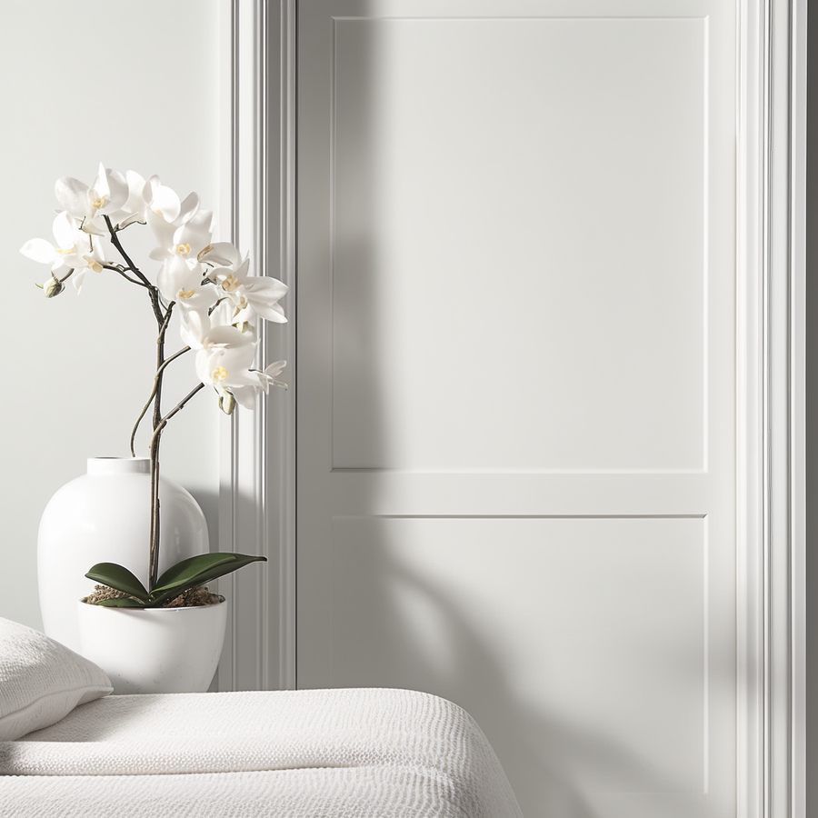
In Flow
An airy, restorative gray green that mirrors the effortless magic of finding your rhythm. Light and fluid, this shade breathes life and harmony into a space, encouraging a natural, unhurried pace where time simply disappears.
SHOP NOW →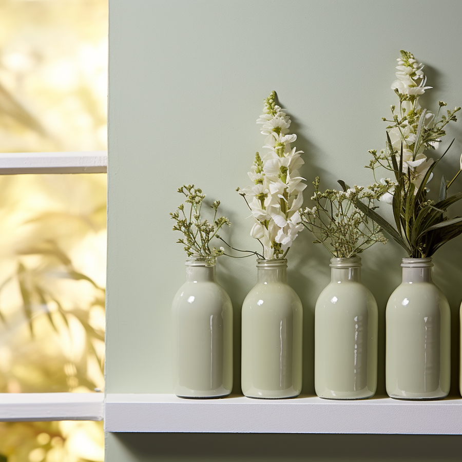
Still Life
A serene, muted grey-green that invites you to pause and appreciate the beauty of the present. Grounded and practical yet full of personality, this calming shade turns any room into a thoughtfully composed, peaceful sanctuary.
SHOP NOW →
Light Leak
A luminous, soft ivory that captures the fleeting, electric moments of a happy creative accident. Radiating a subtle, nostalgic warmth, it bathes your home in a gentle glow that feels both romantic and wonderfully imperfect.
SHOP NOW →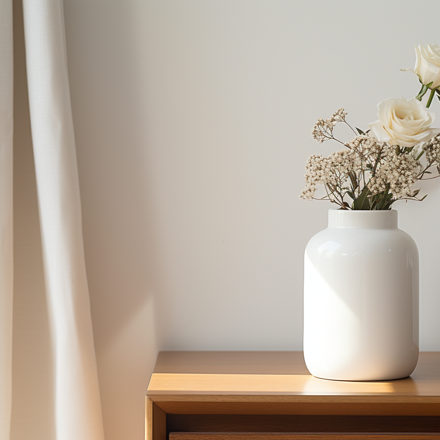
Cold Open
A crisp, invigorating cool white that immediately draws you into the story of a space. Clean and uncompromising, it provides the perfect electric spark to awaken a room, setting a bright, purposeful stage for everyday living.
SHOP NOW →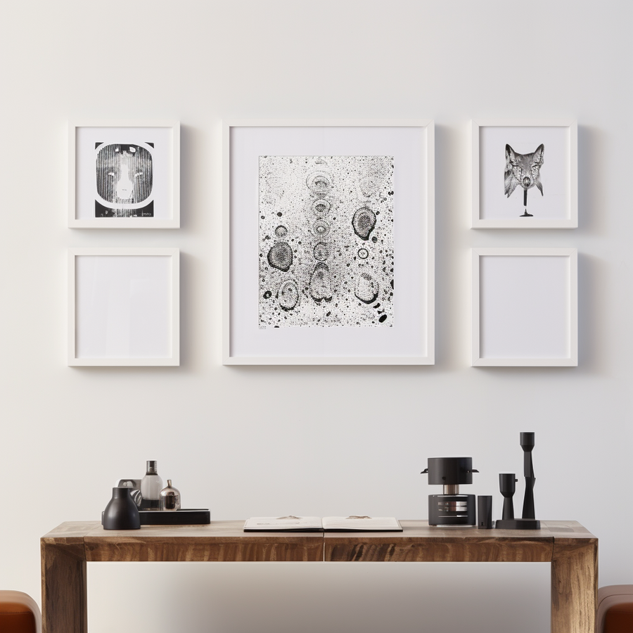
Green Room
A rich, earthy olive green rooted in anticipation and grounded energy. Reminiscent of the restorative space before the curtain rises, this comforting shade adds a layer of lived-in luxury and natural depth to any curated environment.
SHOP NOW →Shadow Side
A moody, muted slate blue that invites quiet reflection. Like the unseen, emotional layers of a space, this grounding hue brings a sense of contemporary, lived-in luxury to any room. It is the perfect backdrop for those introspective moments just before inspiration strikes.
SHOP NOW →
Blank Page
A pure, untinted white representing the ultimate clean slate. It is the essential, bright starting point of the creative journey, offering endless possibilities and a pristine canvas for your evolving story of making.
SHOP NOW →Golden Ratio
A beautifully balanced, warm beige that brings an instant sense of harmony to your walls. Evoking morning light and perfect proportions, this cozy hue creates an inviting, soulful atmosphere that feels inherently right the moment you walk in.
SHOP NOW →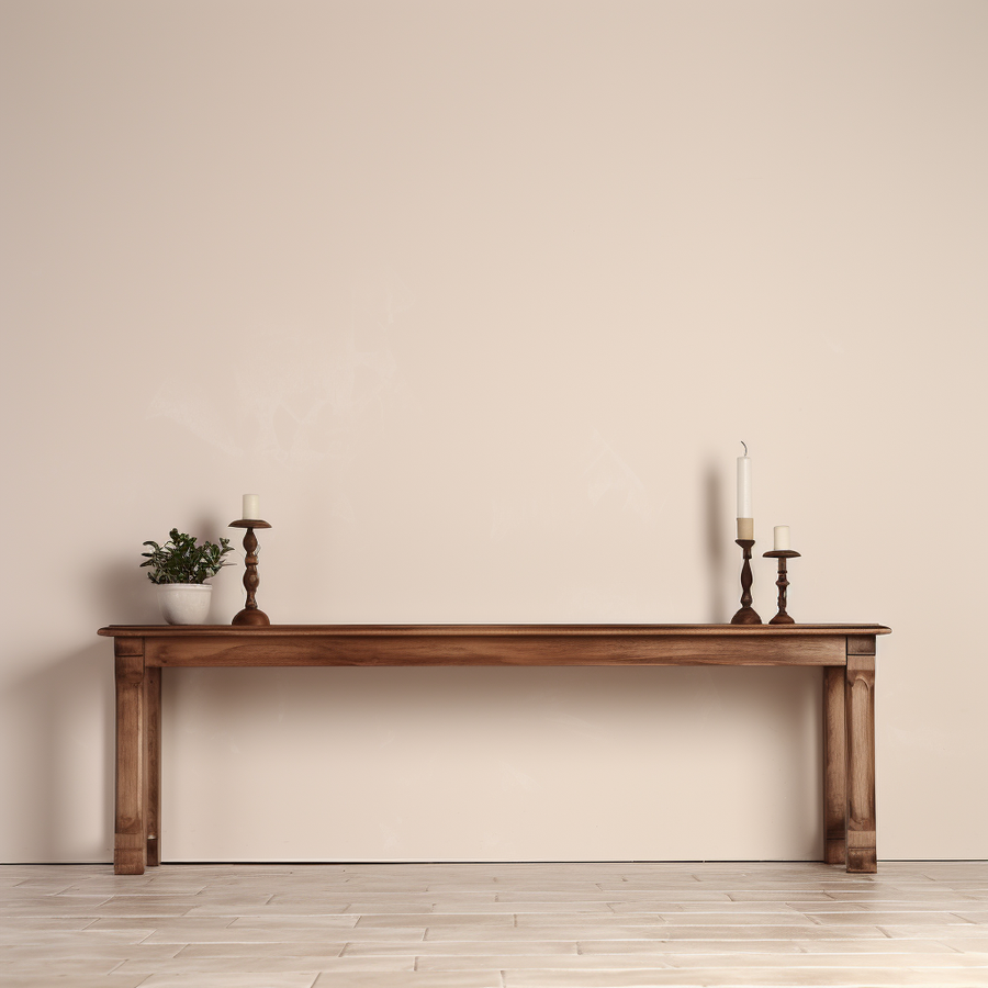
Room Tone
A gentle, welcoming cream that captures the quiet hum and ambient warmth of a lived-in space. This romantic, grounded neutral acts as the foundational layer of your home, allowing your curated, handcrafted details to truly sing.
SHOP NOW →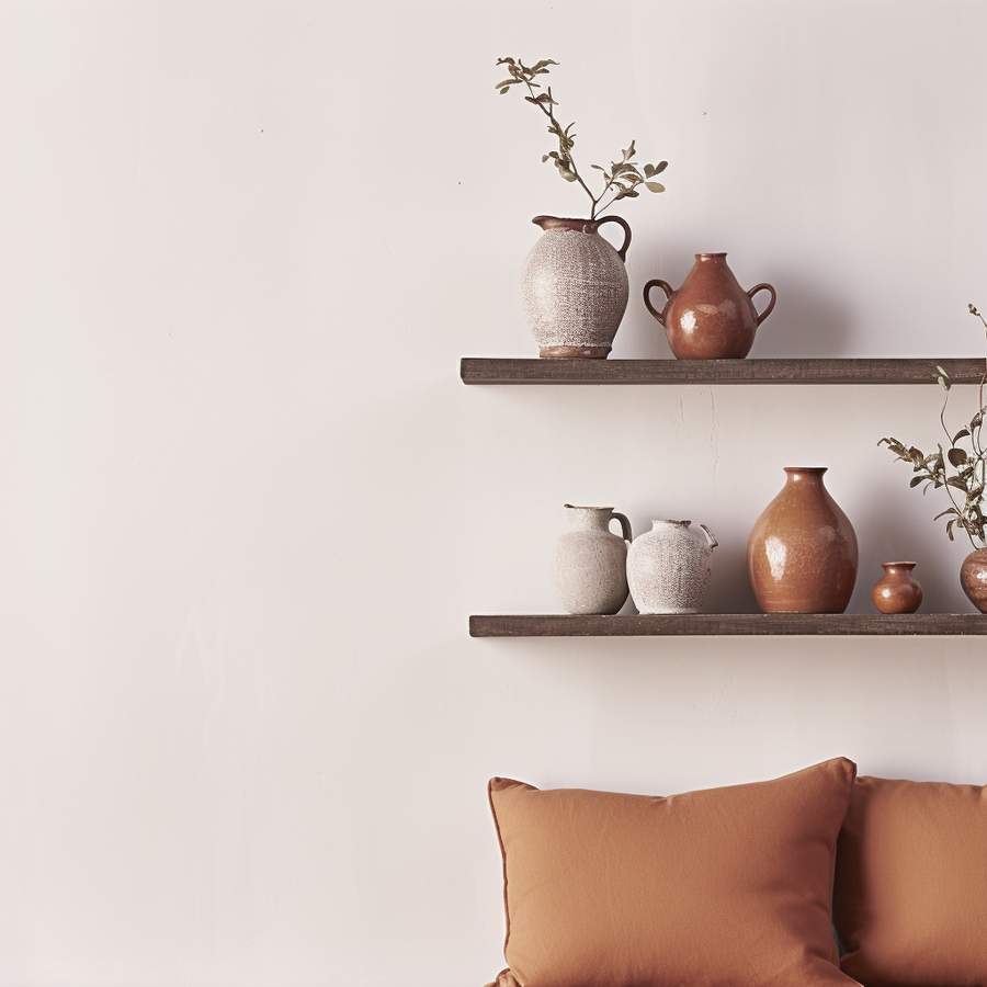
Artist Hours
A deep, contemplative blue-gray inspired by those late nights when you are in the flow and the outside world falls away. This soulful, shadowy tone wraps a room in cozy nostalgia, making it the ultimate retreat for deep focus and quiet creation.
SHOP NOW →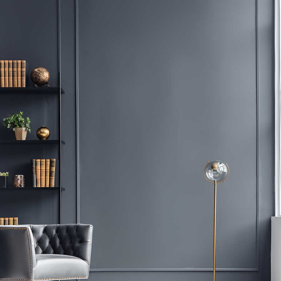
Ink Spill
A bold, decadent burgundy that celebrates the messy, passionate middles of the creative process. Instantly transformative and inherently conversational, this rich hue is perfect for color-drenching a space to create a moody, unforgettable backdrop for your most curated pieces.
SHOP NOW →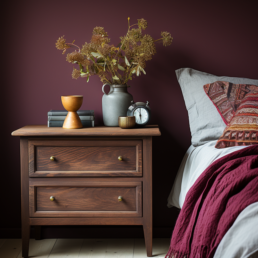
A Conversation with Megan Batoon

Hi, my name is Megan Batoon
I’m a designer and visual artist drawn to creating emotionally layered spaces that make you feel something the moment you walk in- then keep you wanting to stay for hours. When I'm designing, I carefully consider every corner with the sensory experience in mind. Interiors are not just pretty pictures- they are where we experience life.
I’d describe my design style as contemporary eclectic meets lived-in luxury. I tend to lean into curated and hand-crafted environments with a focus on decorating for the senses.
The Maker’s Dozen collection was inspired by the creative process. Following the evolution of an idea from the clean slate of a blank page to the late night artist hours when you’re in flow and the outside world falls away.
I host secret soirees at my garage-converted speakeasy. It’s an “if you know, you know” space where like-minded people can mingle and keep apparel and decor circular. I color drenched the room in ‘Ink Spill’ for a decadent backdrop for found and refined pieces that I’ve curated by season. The bold hue has been an instant conversation starter and keeps the sustainability piece not just within the walls, but also on them.
Phone on do not disturb. Windows wide open. Candle burning and music blasting (mainly hip hop, soundtracks from my favorite musicals, or emo music from the 2000s).
I’ve always felt tension and resistance to labeling myself as one singular type of artist. Identifying as a maker gives me permission to be fluid between mediums and to follow my curiosity- whichever direction it takes me. Creativity isn’t logical or linear, and it shouldn’t be limited. The medium doesn’t matter; it’s the act of making itself that matters.
Quality and repurposing what we already have on the planet are huge values of mine. Up Paint’s mission is directly aligned with my own- reimagining a new life for something that initially served a different purpose.